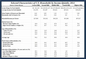
The American Enterprise Institute (AEI) has a very interesting chart out that looks at income inequality by household demographics in 2014.
Using data from the United States Census Bureau, AEI’s Mark Perry highlights various demographic attributes of households across the U.S. by income quintiles in 2014. Some of these characteristics include mean number of earners per household, age, marital status and so on.
Perry explains:
“It’s highly likely that most of today’s high-income, college-educated, married individuals who are now in their peak earning years were in a lower-income quintile in their prior, single, younger years, before they acquired education and job experience. It’s also likely that individuals in today’s top income quintiles will move back down to a lower income quintile in the future during their retirement years, which is just part of the natural lifetime cycle of moving up and down the income quintiles for most Americans. So when we hear Obama, Bernie Sanders, Hillary Clinton and the media talk about an “income inequality crisis” in America, we should keep in mind that basic household demographics go a long way towards explaining the differences in household income in the United States. And because the key income-determining demographic variables are largely under our control and change dynamically over our lifetimes, income mobility and the American dream are still “alive and well” in the US.”
Here is the chart (click to enlarge):

Perry, Assumes way too much, when it comes to income inequality.
The truth that I have lived for 60 years is most stay within a very narrow range of what their income level is able to buy.
A lot depends on who you know to get you into the better paying jobs in the first place.
Also, there are only so many jobs that pay over $75,000 per year. Depending on how much the cost of living goes up compared to income increases over your working life, you may or may not be doing better.
I have never made more than $6,000 to $32,000 per year. But because I served 20 years in the USAF 1975 to 1995, once I start getting Social Security in 2 years, I will have income of more than $34,000, higher than any year of my working life.
If you use the CPI inflation calculator to have the same buying power that my 1995 income. I would need $49,834.33, so even though the numbers look good, I would be better off with 1995 income and prices.
“The American dream are still “alive and well” in the US.”
I take issue with this statement, many people are making more income than they have ever made in their working life, but are living no better than they did 30 to 40 years ago.
Today, most families have to use credit to maintain the illusion of a middle class standard of living. That was not the case 40 years ago. This fact robs many families of money to save for retirement, kids education or a emergency fund and they never get off the credit merry go round.